Generador de Fuentes: El Mapa Completo del Texto con Estilo en 2026
Resumen rápido
- Entre un equipo de marketing que aumenta las tasas de apertura de email con caracteres Unicode y un tatuador que abre una vista previa de fuente en su teléfono durante una consulta, una misma pregunta atraviesa ambas escenas: ¿cómo hacer que el texto se vea diferente sin instalar nada? Los generadores de fuentes han pasado de ser utilidades novedosas a piezas esenciales del kit de redes sociales, branding y diseño.
- En algún punto entre un equipo de marketing que aumenta las tasas de apertura de email con caracteres Unicode y un tatuador que abre una vista previa de fuente en su teléfono durante una consulta, una misma pr.
- La Arquitectura Detrás de Cada Estilo
Proceso editorial
Revisado por SectoJoy y publicado el 22 de junio de 2026. Actualizamos este artículo cuando cambian los detalles del producto, los ejemplos o la guía de la herramienta. Última actualización: 22 de junio de 2026.
SectoJoy
Soy un desarrollador independiente que crea aplicaciones iOS y web, enfocado en productos SaaS prácticos. Me especializo en SEO con IA, explorando constantemente cómo las tecnologías inteligentes pueden impulsar el crecimiento sostenible y la eficiencia.
En algún punto entre un equipo de marketing que aumenta las tasas de apertura de email con caracteres Unicode y un tatuador que abre una vista previa de fuente en su teléfono durante una consulta, una misma pregunta atraviesa ambas escenas: ¿cómo hacer que el texto se vea diferente sin instalar nada? La respuesta ha remodelado de manera silenciosa la forma en que millones de personas se presentan en línea. Los generadores de fuentes —herramientas que transforman texto plano en salida con estilo lista para copiar y pegar— han pasado de ser utilidades novedosas a piezas esenciales del kit de redes sociales, branding y diseño. El cambio ocurrió tan rápido que la propia terminología todavía está alcanzándolo: “font generator” significa dos cosas fundamentalmente distintas según si necesitas una mejora rápida para una bio de Instagram o un tipo de letra personalizado para un sistema de identidad de marca. Esa confusión es señal de una categoría que todavía está definiendo sus límites, y los datos sugieren que la demanda solo se acelera.
Tres fuerzas impulsan este momento. Primero, el bloque Mathematical Alphanumeric Symbols de Unicode —la columna técnica de toda herramienta de fuentes para copiar y pegar— recibió una expansión significativa en Unicode 16.0, cubriendo vacíos que antes dejaban ciertos estilos con caracteres faltantes. Segundo, los creadores de fuentes con IA han surgido como una categoría paralela, comprimiendo el diseño profesional de tipos de meses a minutos y obligando a los usuarios a lidiar con la distinción entre “texto con estilo” y “fuentes reales”. Tercero, los datos de engagement ya no son anecdóticos: visitas de perfil up 40%, tasas de lectura completa de email up 67%, solicitudes de clans de Discord tripling —son incrementos consistentes y repetibles documentados en todas las plataformas. El texto con estilo ya no es un capricho estético; es una palanca con retornos cuantificables, y entender cómo usarlo —y dónde no hacerlo— es lo que separa una implementación eficaz del ruido.
La Arquitectura Detrás de Cada Estilo
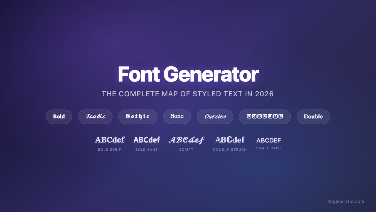
Cada generador de fuentes del que se habla aquí se apoya en la misma base técnica: sustitución de caracteres Unicode, no instalación de fuentes. Cuando escribes “Hello” en un generador y obtienes una versión cursiva, no estás obteniendo una nueva fuente —estás obteniendo cinco code points Unicode distintos que parecen letras cursivas. La letra latina A puede mapear a U+1D400 (Mathematical Bold Capital A) o U+1D504 (Mathematical Fraktur Capital A), y cada carácter destino ya está codificado en tu sistema operativo. Por eso la salida funciona en Instagram, Discord, WhatsApp y TikTok sin que ningún lado instale nada. Los caracteres Unicode que impulsan estas transformaciones provienen principalmente del bloque Mathematical Alphanumeric Symbols, que cubre estilos bold, italic, script, Fraktur, double-struck y monospace con la mayor compatibilidad de dispositivo de cualquier rango de texto con estilo.
Pero la compatibilidad no es uniforme. Cuatro bloques Unicode distintos contribuyen a la paleta completa de estilos: Mathematical Alphanumeric Symbols para lo básico, Enclosed Alphanumerics para caracteres encerrados en círculos, caracteres Fullwidth CJK para el aspecto de texto ancho del Vaporwave, y bloques Fraktur/Blackletter para estilos góticos. Los caracteres del primer bloque se renderizan en casi cualquier dispositivo moderno. Los caracteres de los bloques más exóticos —en particular las combining diacritical marks usadas en texto Zalgo— producen esos típicos cuadritos o signos de interrogación en hardware antiguo. Entender de qué bloque proviene un estilo es el atajo técnico más útil para predecir si tu texto con estilo se mostrará correctamente.
Una frontera significativa recorre este espacio y la mayoría de los usuarios nunca la nota. Los generadores Unicode y los creadores de fuentes con IA son herramientas categóricamente distintas. Uno mapea caracteres existentes; el otro genera archivos de tipo de letra originales (TTF, OTF) desde cero usando aprendizaje automático. Herramientas como Lipi.ai pueden producir una fuente con licencia comercial en unos 60 segundos —un proceso que tradicionalmente tomaba meses de diseño manual de glifos. Los generadores de fuentes con IA no reemplazan a las herramientas Unicode; sirven a necesidades completamente diferentes. Usas un generador Unicode cuando necesitas texto con estilo que se copie y pegue en una bio de Instagram. Usas un creador de fuentes con IA cuando necesitas un tipo de letra instalable para un logo, un sitio web o un diseño de empaque. Confluir ambos genera frustración en los dos lados.
De la Atención a la Precisión: Qué Hace Realmente Cada Estilo
Las ocho categorías de generadores de fuentes que han surgido no son aleatorias. Se mapean a capas funcionales distintas: estilos diseñados para captar la atención, estilos diseñados para señalar identidad y estilos diseñados para la precisión.
En la capa de atención se sitúan los estilos bold y aesthetic. El texto bold explota un proceso neurológico llamado preattention —el cerebro dirige el foco a los elementos de alto contraste antes de que intervenga el pensamiento consciente. Los datos de eye-tracking muestran que los titulares bold reciben 73% más atención visual que los equivalentes de peso estándar, y los A/B tests documentan de forma consistente 67% más tasas de lectura completa de email y 45% más tasas de clic en CTA. El mecanismo no es preferencia subjetiva; es procesamiento visual cableado. Bold Sans-Serif se lee como profesional y moderno, mientras que Gothic / Fraktur Bold se lee como transgresor y consolidado —un clan de gaming que cambió a etiquetas Gothic bold vio un aumento de reclutamiento de 40% simplemente porque el estilo los hacía parecer más creíbles en las salas.
En la capa de identidad se sitúan los estilos calligraphy, aesthetic y beautiful. Son herramientas de señalización de marca. Una marca de skincare que rediseñó su logo con fuentes calligraphy vio un aumento de ventas de 25% en tres meses porque los clientes empezaron a asociar la marca con el lujo. La personalidad de marca que definas primero determina qué estilo funciona: script/cursive para elegancia, monospace para credibilidad técnica, fullwidth para energía retro. Los datos son notablemente consistentes —las visitas de perfil aumentaron 40% en dos semanas para un usuario de Instagram que cambió a fuentes script aesthetic, y el uso profesional y de negocios de fuentes con estilo en invitaciones de boda produjo 30% más respuestas positivas en comparación con versiones de texto plano.
En la capa de precisión se sitúan los estilos específicos para números. La regla práctica es directa: números bold para la atención (precios, titulares), números monospace para la precisión (códigos de serie, IDs de producto, fechas). Los dígitos monospace eliminan la desalineación visual que introducen las fuentes proporcionales —la diferencia entre leer “SN-000123” con claridad y dudar si aquello es un cero o la letra O. Para cualquier contexto donde la precisión de transcripción importe, monospace no es una elección estética sino funcional.
Dónde se Rompen las Cosas — y Qué Hacer al Respecto
La compatibilidad entre plataformas no es una nota al pie menor; es el eje sobre el que ocurren la mayoría de las decepciones con los generadores de fuentes. Las pruebas muestran que Instagram, Discord, TikTok, Twitter y WhatsApp renderizan Unicode bold con una compatibilidad near-100%, pero LinkedIn elimina ciertos estilos Gothic y Fraktur, situándose en aproximadamente 85%. Cuanto más te alejas del bloque Mathematical Alphanumeric Symbols, más probable es que veas fallos de renderizado —y esos fallos son invisibles para ti hasta que alguien con un dispositivo antiguo te dice que tu texto aparece como cuadritos.
La accesibilidad es la otra falla, y corre más profundo. Los lectores de pantalla a menudo interpretan los caracteres Unicode decorativos como símbolos individuales en lugar de letras, leyendo en voz alta “Mathematical Bold Capital A” en vez de la palabra a la que pertenece la letra. No es una preocupación teórica —afecta a cada usuario con discapacidad visual que se encuentre con tu texto con estilo. La guía práctica es consistente en todos los clusters: aplica estilo a no más del 10% de tu texto total, mantén la información crítica en texto plano y siempre ofrece alternativas sin estilo para reglas, instrucciones, direcciones y números de teléfono. Los estilos Fraktur y blackletter merecen precaución especial —sus trazos ornamentados crean problemas de legibilidad incluso para usuarios con visión, y nunca deben usarse para datos donde la precisión importe.
Texto Bold: La Línea Base de Rendimiento
Los lectores no deciden mirar el texto bold —sus ojos van ahí primero, automáticamente. Ese único hecho explica por qué el formato bold es el estilo más probado y más validado del kit del generador de fuentes. Los A/B tests documentan una tasa de lectura completa 67% mayor para titulares bold de email, un aumento de 45% en clics de CTA y un aumento de 40% en visitas de perfil de Instagram cuando los elementos clave de la bio están en bold. La neurociencia es clara: la preatención dirige los ojos a los elementos de alto contraste antes de que el lector tome cualquier decisión consciente, lo que significa que el texto bold funciona incluso cuando el lector no está intentando notarlo. Los datos de compatibilidad entre plataformas son igualmente alentadores —Unicode bold se renderiza correctamente en todas las principales plataformas sociales, lo que lo convierte en el estilo de alto impacto más seguro disponible.
El Panorama de Herramientas Gratuitas: Lo Que Realmente Obtienes
Aplica estilo a no más del 10% de tu texto total. Usa las fuentes con estilo como acentos, no como el plato principal. Esa “regla del 10%” es la guía práctica más útil que ha surgido del ecosistema de generadores de fuentes gratuitos, y aborda el error más común: el sobre-estilizado. Los generadores gratuitos mapean texto plano a caracteres Unicode en cientos de estilos, pero la salida es tan buena como la contención con la que se aplica. Las herramientas más amplias cubren bold, cursive, gothic, zalgo, bubble, monospace y docenas de sub-variantes, todas produciendo texto para copiar y pegar que funciona sin descargas. La variable clave es el límite de caracteres de tu plataforma destino —los caracteres Unicode con estilo suelen consumir más bytes que sus equivalentes en texto plano, lo que significa que una bio de Instagram que cabe en texto plano puede desbordarse al aplicarle estilo. Para cualquiera que use texto con estilo en líneas de asunto de email, la guía se divide: un estilizado con buen gusto puede aumentar las tasas de apertura, pero los símbolos excesivos o el texto con estilo todo en mayúsculas puede disparar los filtros de spam.
Cuando la Fuente es Permanente: Texto para Tatuajes
La piel no es papel. Con el tiempo, la tinta se expande naturalmente bajo la piel, lo que cambia el aspecto de tu tatuaje. Esa advertencia, repetida en foros de tatuadores y guías de diseño, recoge la aplicación de mayor riesgo de los generadores de fuentes: texto que estará literalmente en tu cuerpo durante décadas. El contexto del tatuaje introduce consideraciones que ningún otro caso de uso enfrenta —las fuentes que envejecen bien comparten cuatro rasgos específicos: trazos más gruesos, formas simples, buen espaciado y bajo detalle. Los tatuajes de script ultrafinos pierden legibilidad a medida que la tinta se expande, y el espaciado ajustado hace que las letras se fundan con los años. El paso innegociable es la prueba de impresión: imprimir el texto generado al tamaño real del cuerpo y convivir con él antes de la cita, porque las pantallas retina hacen que todo se vea más nítido de lo que aparecerá en la piel. Los estilos Gothic & Blackletter son particularmente populares para texto de tatuajes porque el peso bold de sus trazos resiste el desvanecimiento y el desenfoque que destruyen los scripts más finos con el tiempo.
Elegancia a Escala: Calligraphy para Marca y Evento
Los clientes empezaron a asociar la marca con el lujo por la elegante calligraphy. Esa reacción —documentada por una marca de skincare que vio un aumento de ventas de 25% tras un rediseño de logo con calligraphy— ilustra el poder comercial del estilizado con calligraphy. Los generadores de fuentes de calligraphy se sitúan en la intersección de la expresión personal y el diseño profesional: ahorran a los usuarios individuales más de $400 en invitaciones de boda en comparación con contratar a un calígrafo profesional, y ayudan a los diseñadores profesionales a aumentar los márgenes de beneficio hasta un 40% en proyectos de branding al usar los generadores como herramientas de prototipado rápido. El punto de decisión crítico es la legibilidad y la escalabilidad —probar la fuente elegida en una pantalla móvil, una tarjeta de presentación y un mockup de valla publicitaria antes de comprometerse, porque un estilo de calligraphy que se ve elegante en un monitor puede ser ilegible a tamaño de tarjeta de presentación.
Estilos Aesthetic como Identidad de Marca
Más del 40% de los usuarios eligen estilos script, lo que los convierte en la categoría más popular del espacio de generadores de fuentes aesthetic. Pero la verdadera intuición no es qué estilo gana el concurso de popularidad —es que el panorama de fuentes aesthetic ahora se organiza por subculturas culturales en lugar de por categorías técnicas. Vaporwave se mapea a caracteres Fullwidth CJK y la nostalgia de los 80-90. Cottagecore se mapea a scripts fluidos y contenido de naturaleza. Y2K se mapea a caracteres redondeados y burbujeantes y a la energía de principios de los 2000. Estos mapeos convierten una selección técnica de Unicode en una decisión de identidad de marca, y el bloque Mathematical Alphanumeric Symbols sustenta a la mayoría. Los datos de engagement refuerzan la inversión: un usuario de Instagram documentó un aumento de 40% en visitas de perfil en dos semanas tras cambiar a fuentes script aesthetic, y un usuario de Discord que cambió su nombre de usuario al estilo double-struck vio cómo sus solicitudes de amistad se triplicaban.
El Marco de Decisión: Fuentes Beautiful para Cada Contexto
Un clan cambió su etiqueta de [APEX] a una versión estilizada con Unicode y las solicitudes se triplicaron. Esa anécdota del mundo del gaming en Discord es un microcosmos de lo que el estilo de fuente adecuado hace a cualquier escala —señala credibilidad antes de que el contenido se lea. El recurso más accionable surgido de este espacio es la matriz de selección de fuentes que mapea nueve tipos de marca y evento a estilos Unicode específicos: Cursive/Script para bios de Instagram, Bold/Gothic para gaming, Calligraphy para bodas, Monospace/Sans Bold para marcas tecnológicas, y así sucesivamente. Cada emparejamiento está respaldado por un razonamiento sobre por qué ese estilo funciona en ese contexto, incluyendo el bloque Unicode específico del que proviene y los compromisos de compatibilidad entre plataformas. La actualización Unicode 16.0 ha ampliado el conjunto de caracteres disponibles con nuevas variantes sans-serif bold italic, lo que significa que algunos estilos que antes tenían letras faltantes ahora se renderizan de forma más completa —una mejora silenciosa pero significativa para cualquiera que use el rango completo de estilos.
Números: La Variable Pasada por Alto
La regla práctica: bold para la atención, monospace para la precisión. El estilizado de fuentes específico para números es la dimensión más pasada por alto del espacio del generador de fuentes porque la mayoría de la gente piensa en el estilizado de fuentes como un problema del alfabeto. Pero los dígitos aparecen en precios, fechas, códigos de serie, números de teléfono y números de versión —contextos donde el estilo adecuado no es solo cosmético sino funcional. La distinción entre un número bold que atrae la mirada a un punto de precio y un número monospace que mantiene los dígitos del código de serie alineados y legibles es la diferencia entre un texto con estilo que ayuda y uno que confunde. Los motores de búsqueda tratan los dígitos con estilo como caracteres de texto normales sin beneficio ni penalización de ranking, así que la decisión es puramente sobre legibilidad humana —y para números de teléfono, direcciones y códigos de producto, esa legibilidad no es opcional.
Estilos Alternativos y los Bordes del Mapa
Si buscas “font generator” esperando crear un tipo de letra personalizado, puedes sentirte decepcionado por una herramienta Unicode que solo ofrece estilos preestablecidos. Esa tensión —entre la herramienta que la gente imagina y la herramienta que realmente existe— es la confusión definitoria de la categoría de generador de fuentes alternativo. Las cinco familias de estilos más comunes (cursive/script, gothic u Old English, texto Zalgo, bold/italic/double-struck, y circled/squared) cubren la gran mayoría de los casos de uso, pero son sustituciones preestablecidas, no creaciones personalizadas. La guía de selector de estilos mapea cada una a su mejor plataforma: Gothic para apodos de Discord y gaming, Cursive para nombres en pantalla de TikTok e Instagram, Zalgo para contenido de temática de terror. Para cualquiera que enfrente fallos de renderizado, el diagnóstico es siempre el mismo —verifica si el estilo proviene del bloque Mathematical Alphanumeric Symbols (seguro) o de rangos más exóticos que pueden no estar en el repertorio de fuentes de tu dispositivo.
Artículos Relacionados
Generador de fuentes estéticas: la guía definitiva para texto Unicode con estilo

Generador de fuentes de caligrafía: herramienta online gratuita para estilos de texto elegantes
Generador de fuentes alternativas: estilos Unicode instantáneos para copiar y pegar (guía 2026)